When Christine Grace came to me for brand design, she was standing on the edge of a new era. She had grown—as a woman, as a photographer, as an artist. But her old brand? It hadn’t kept up. It looked nice enough, but it wasn’t her. Not really. And she felt it.
So, we reimagined everything.
The Client
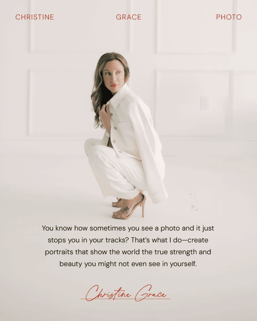
Christine is a luxury photographer based in Canada, best known for turning ordinary moments into cinematic, fashion-forward portraits. Her work walks the line between editorial and emotional—balancing strong, sculptural posing with softness, warmth, and intimacy. She serves women, couples, and families who crave timelessness, beauty, and confidence in front of the lens.
The Brief
Christine was ready for a brand that reflected the woman she had become. After walking through deeply personal transformations in her own life, she wanted a visual identity that felt bold, artistic, and fully her. She needed strategy, design, and website support to match the confidence she was stepping into.
Our goals:
- Build a brand experience that blends high fashion with heartfelt storytelling.
- Create a logo suite that feels like art—distinctive, elevated, and undeniably hers.
- Translate her new identity into a website that feels like walking into a gallery of visual poetry.
The Process
We started with deep strategy. Through brand exploration and collaborative refinement, we uncovered Christine’s unique position: she doesn’t just take photos—she transforms the way women see themselves. Her clients walk in unsure and walk out empowered.
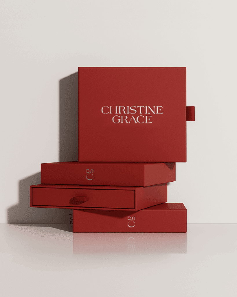
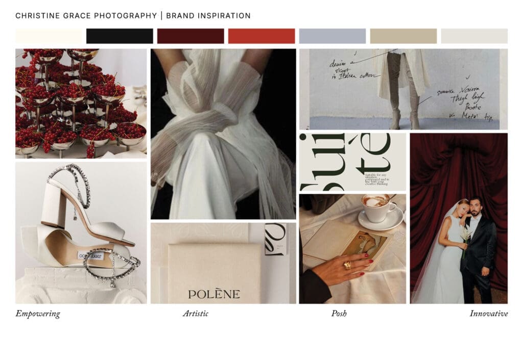
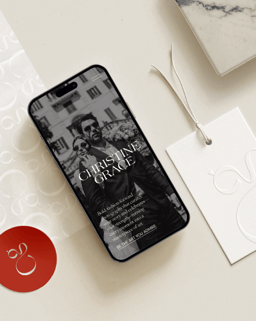
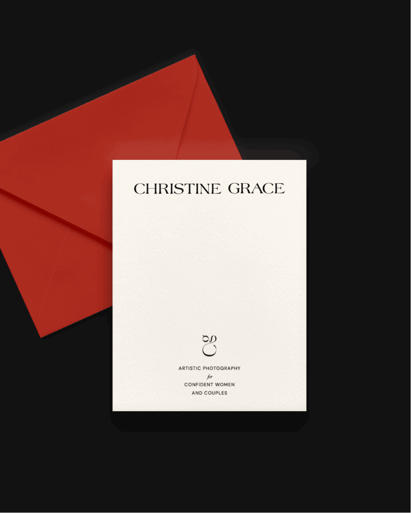
Visually, we explored high-end fashion references, textured materials like silk and velvet, and minimalist interiors to land on a vibe that felt both luxurious and intimate. The final palette leans into muted neutrals with a striking pop of Crimson Reverie—a deep, wine-toned red that commands attention.
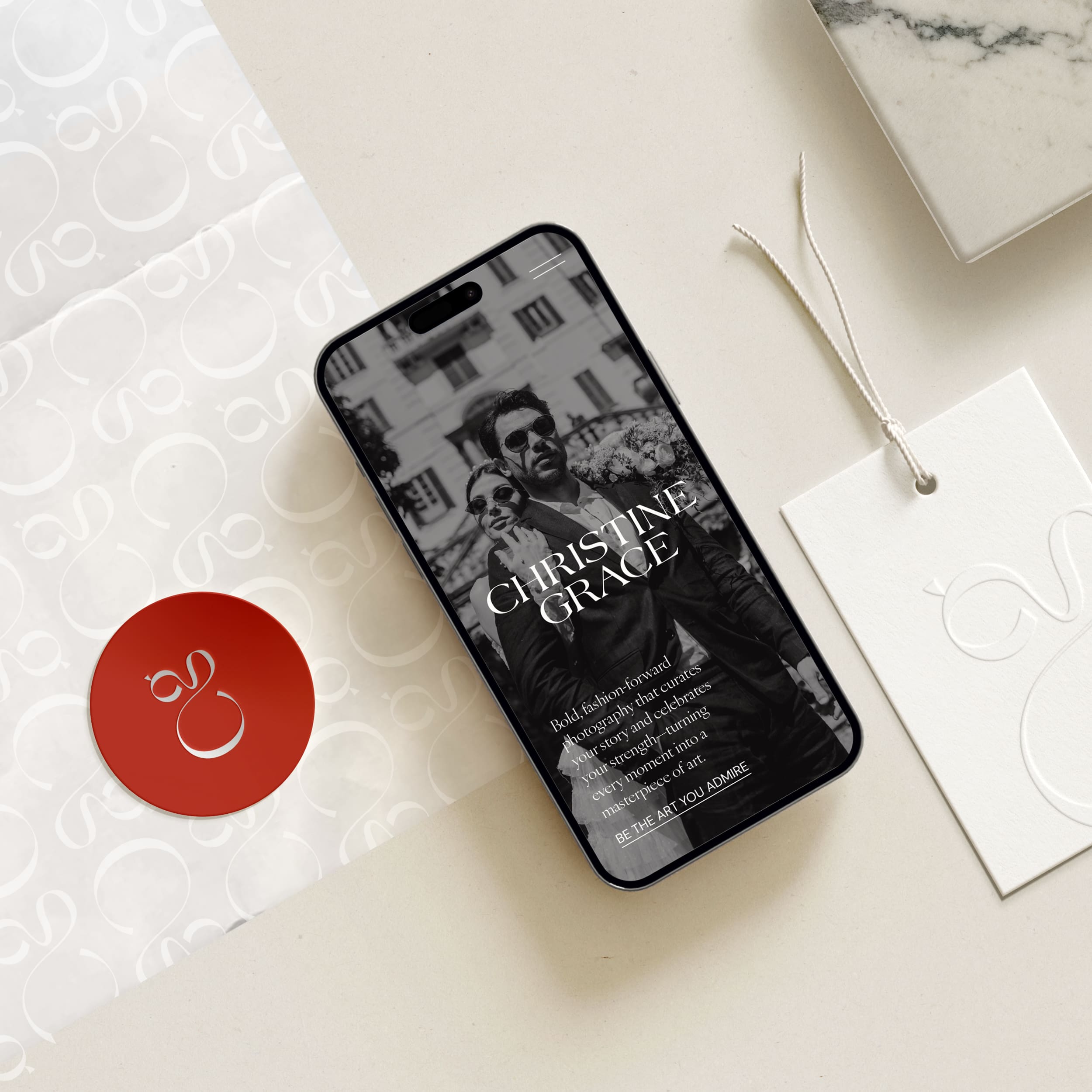
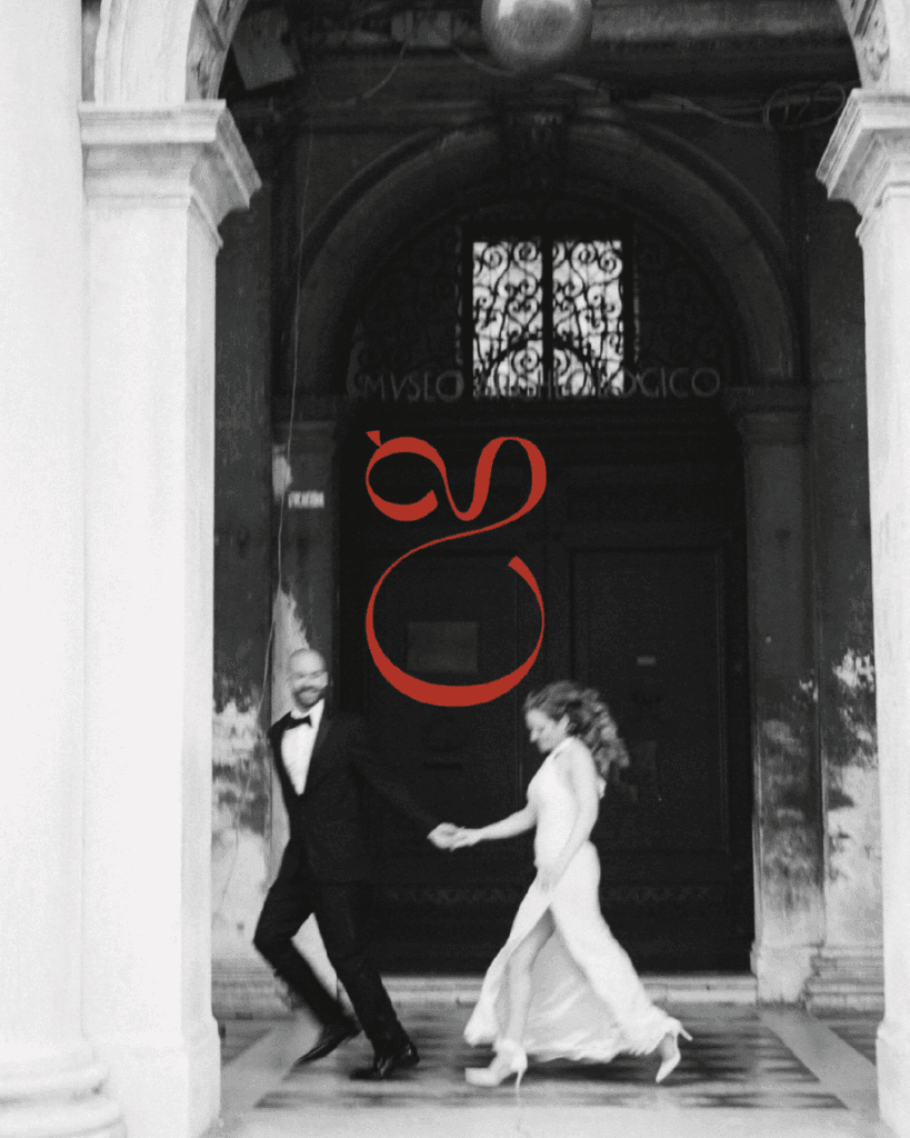
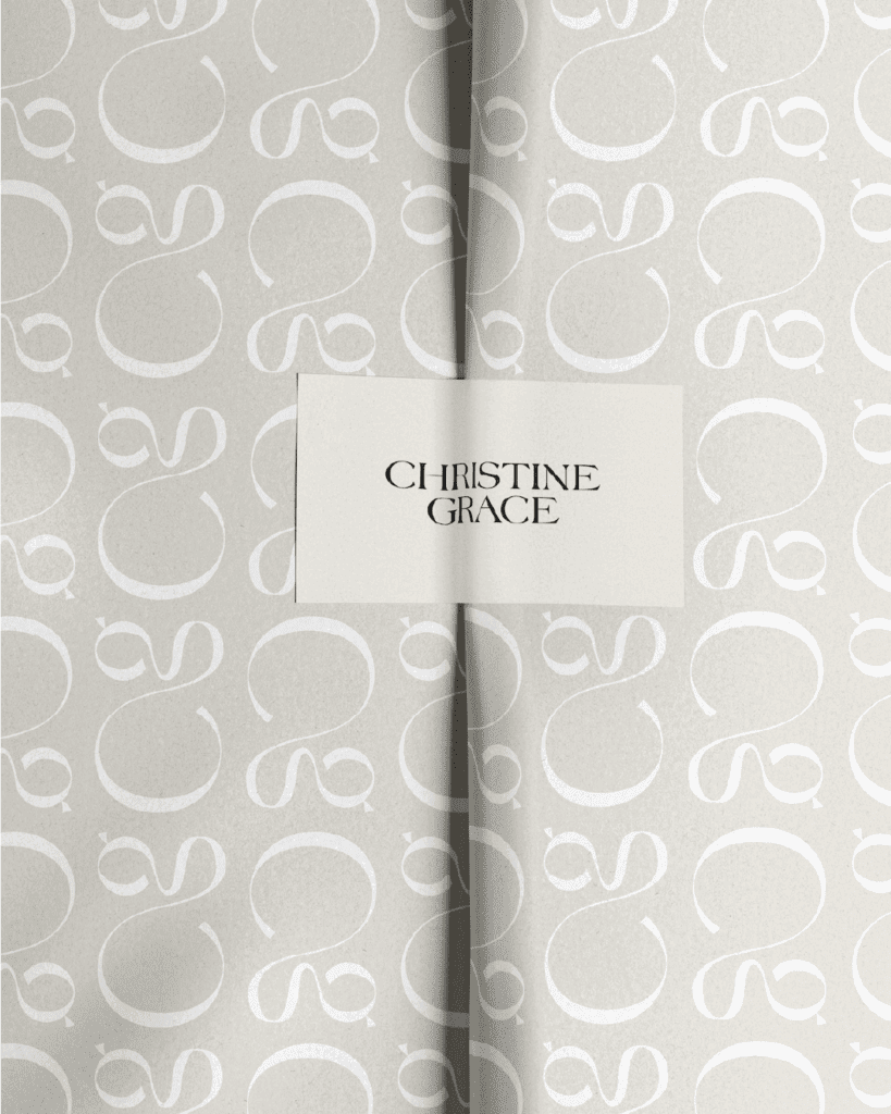
The submark was a labor of love. Sculptural, unexpected, and deeply personal, it’s designed to feel like a signature—a mark of transformation. Every detail of the logo suite was crafted with intention, from the serif elegance of the typography to the negative space that adds intrigue.
The Solution
We delivered:
- A full brand strategy and positioning document.
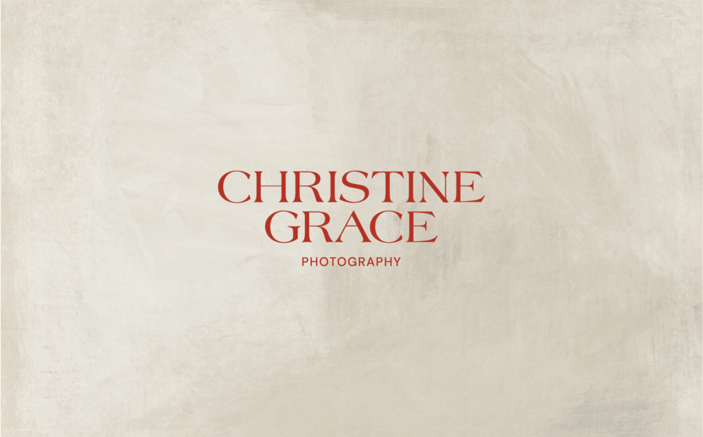
- A refined logo suite including primary, secondary, and a meticulously crafted submark.
- Font and color direction rooted in fashion-forward minimalism.
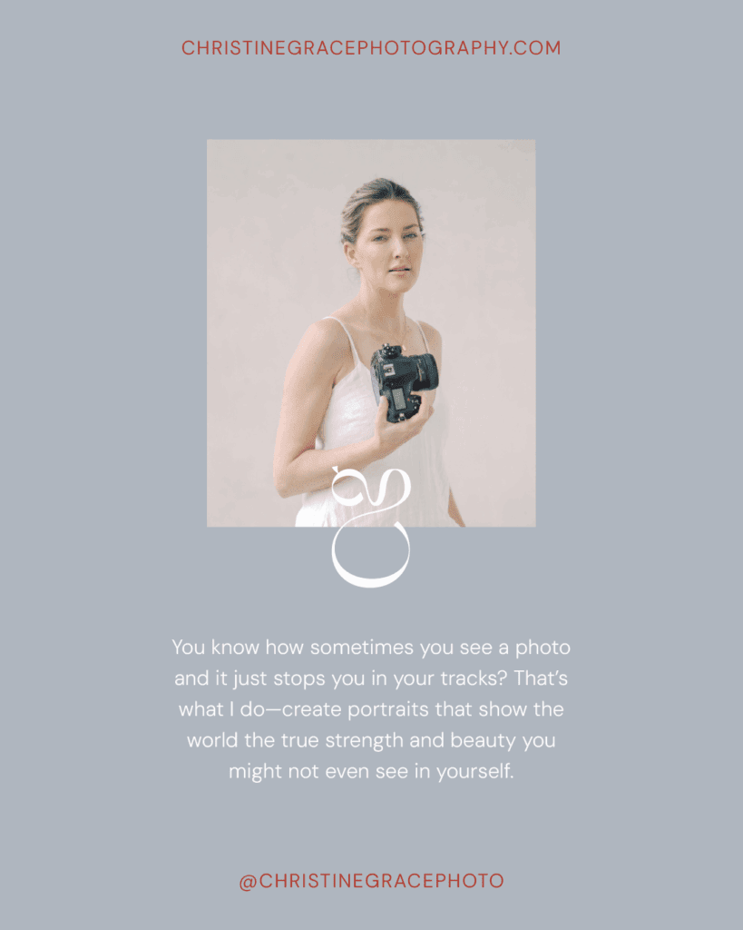
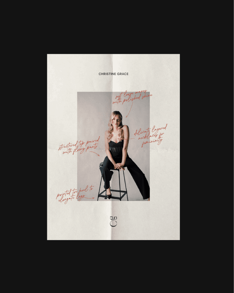
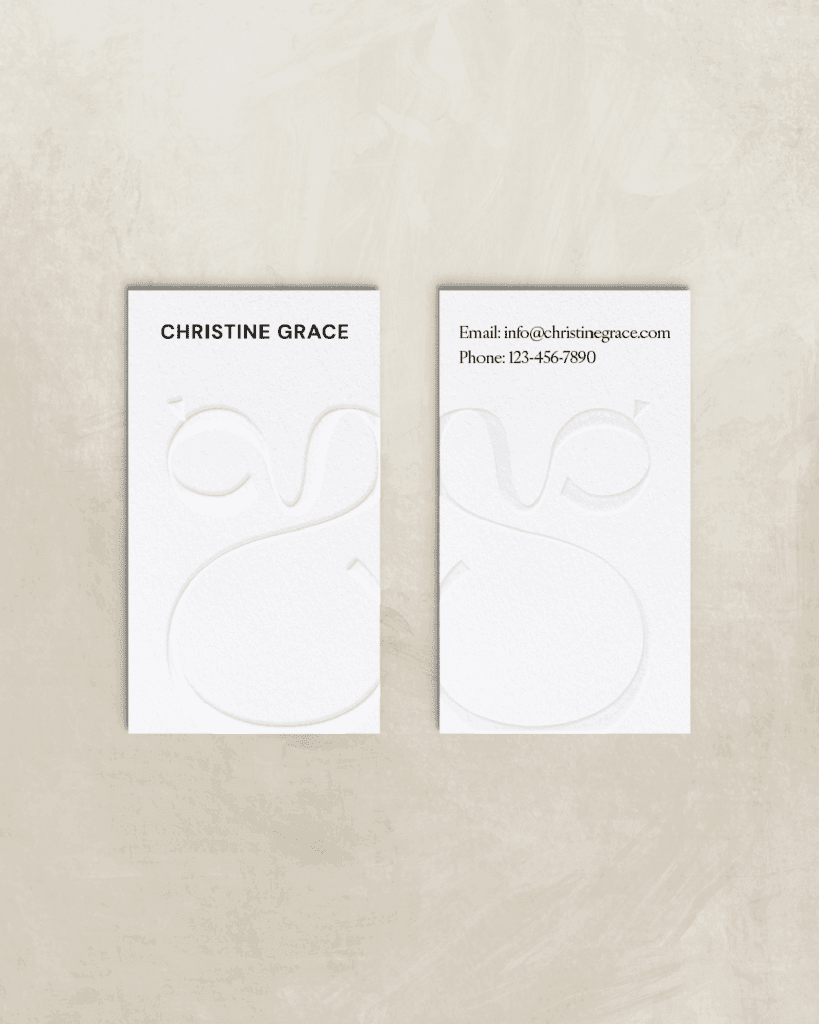
- A suite of mockups including business cards, social media graphics, packaging concepts, and more.
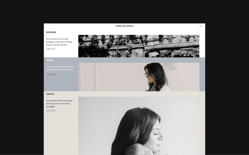
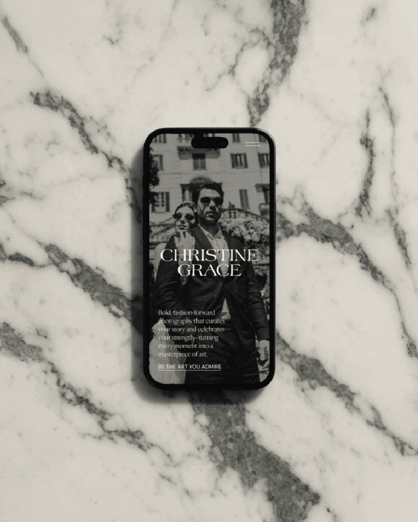
- Website design that showcases Christine’s portfolio as a high-end experience. You can explore the final site at christinegracephotography.com.
The site is an immersive visual scroll that feels more like a curated magazine spread than a traditional photo site. Subtle motion, layered textures, and bold headlines guide the viewer through Christine’s world.
The Impact
In Christine’s words: “Cassie didn’t just design my brand—she gave me the confidence to step into who I really am as an artist.”
Even before launching, Christine felt the shift. Her confidence soared. She finally saw herself in her brand, and her audience is starting to feel it too. In fact, she talked openly about the emotional and visual transformation in this Instagram reel—a behind-the-scenes look at just how powerful the entire process was for her. It didn’t just change how her work looks online—it reshaped how she shows up in her business and connects with her people.
It was an experience that left both of us inspired—and now, it’s doing the same for her clients.


Credits
Creative Direction, Brand Strategy, Design & Website: Gatherie Creative
Photography: Christine Grace Photography
Ready to rebrand?
Step into my office. Let’s make your brand unforgettable.
