This wedding photographer brand identity started with a question: what if a brand could feel the way a wedding day does? Karen wasn’t just after polish or professionalism—she wanted to bottle up the joy, intimacy, and memory-making magic she captures in her photos. This wasn’t a brand refresh. It was a reimagining of how connection shows up visually, emotionally, and experientially.
So we designed a brand that could hold that feeling—quietly confident, deeply inviting, and warm in a way that lingers. A brand that feels like a familiar story told in a new light.
The Client:
Karen Michelle Photography
Wedding Photographer
Based in Philadelphia and New Jersey

The Brief
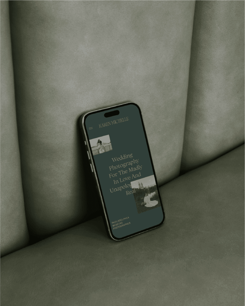
Karen reached out for a full wedding photographer brand identity and website to reflect the experience she delivers: one grounded in trust, ease, and deep emotional connection. Her business was growing, and her work was strong. Still, her brand didn’t yet reflect the level of care and craft she poured into every client experience.
She wanted to attract the right people—clients who shared her values and would see themselves reflected in her approach. The goal? A brand that felt warm, artistic, and reliable, with just the right amount of personality.
The Process
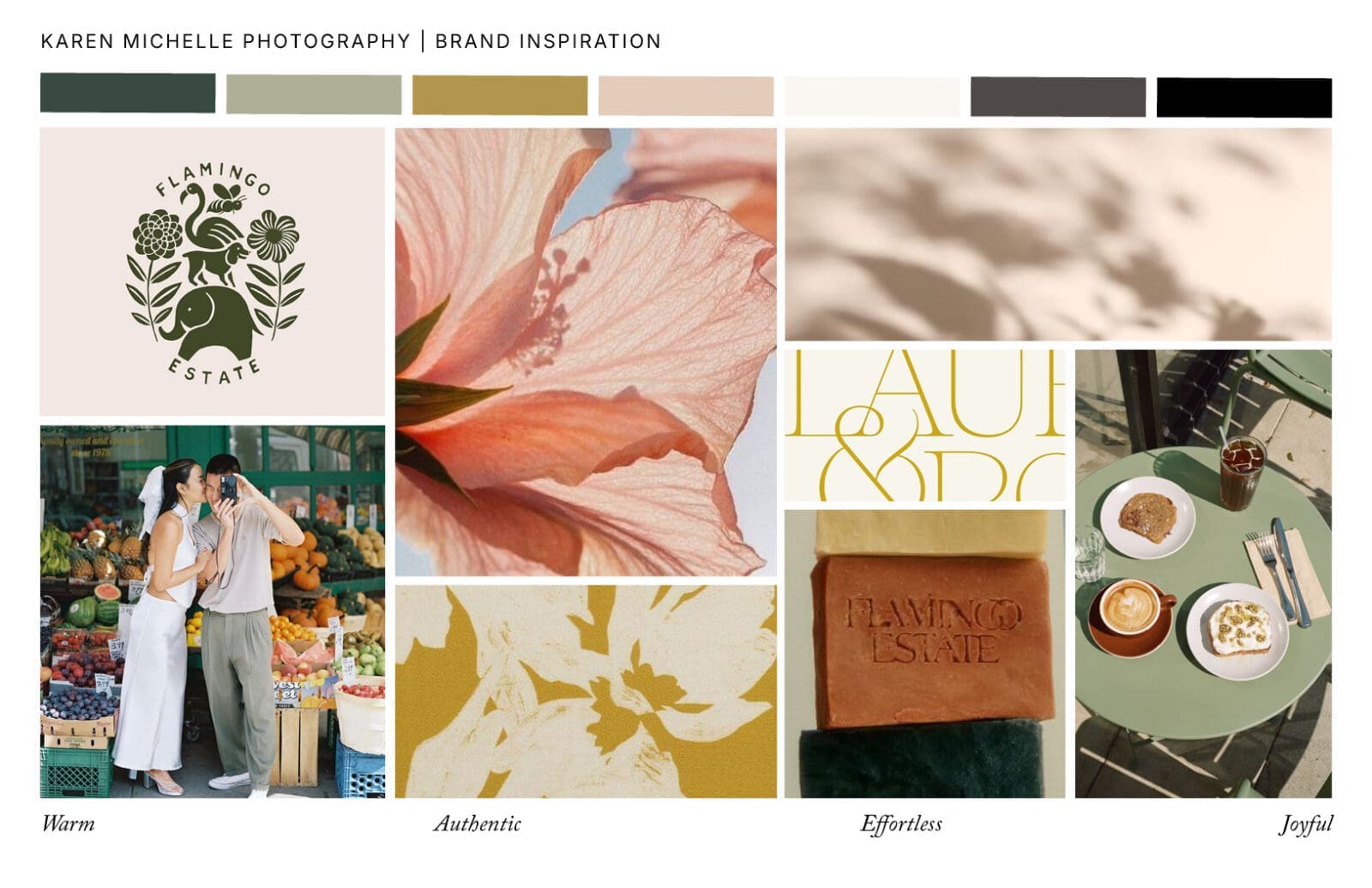
We began with strategy: defining her audience, exploring her story, and identifying the emotional core of her work. Her clients value joy over perfection. They care deeply about experience. And they’re drawn to a photographer who can both guide and adapt—someone who’s calm in the chaos and attentive to the magic.
We also looked at the competitive landscape. Many photographers in her space showcased beautiful work but kept their personalities behind the lens. There was a lack of emotional resonance and human connection in how their brands showed up. This gave us an opportunity: position Karen not just as a skilled photographer, but as a trusted presence—someone who makes her clients feel seen, understood, and celebrated.
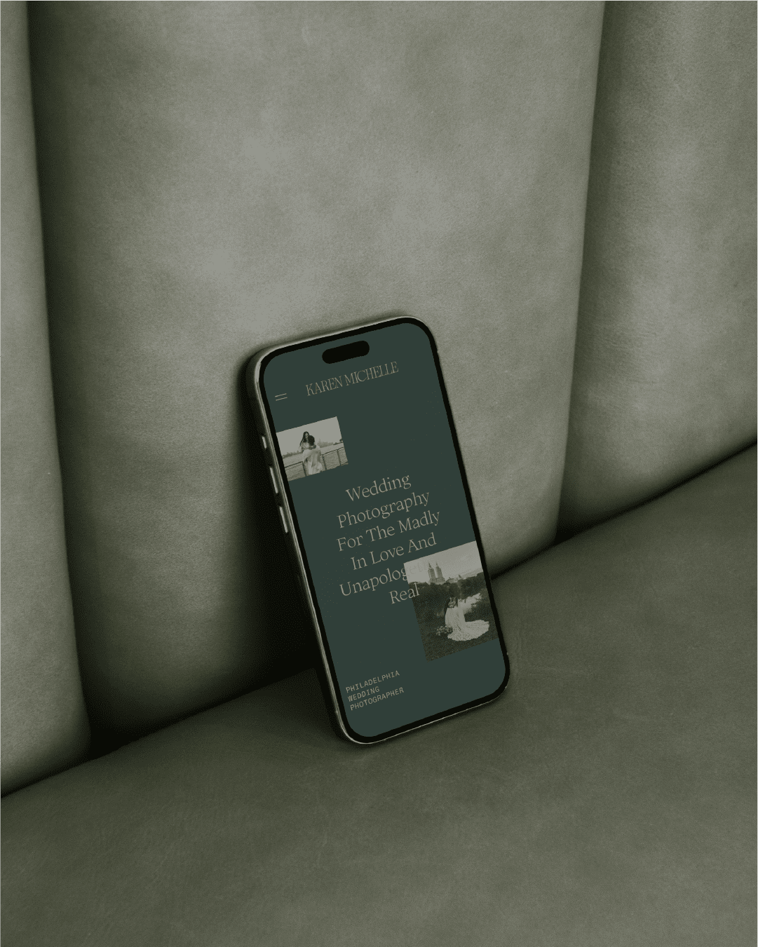
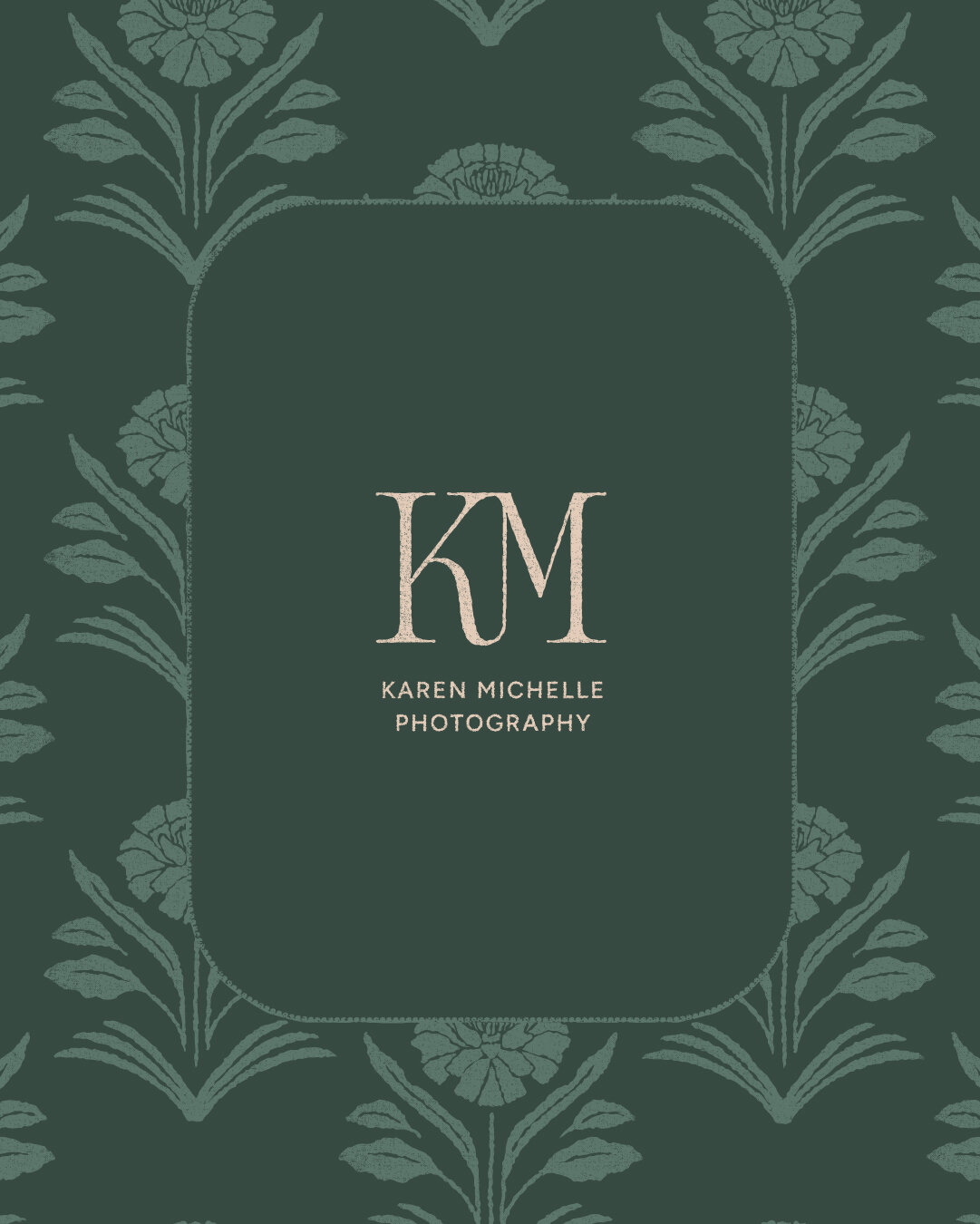
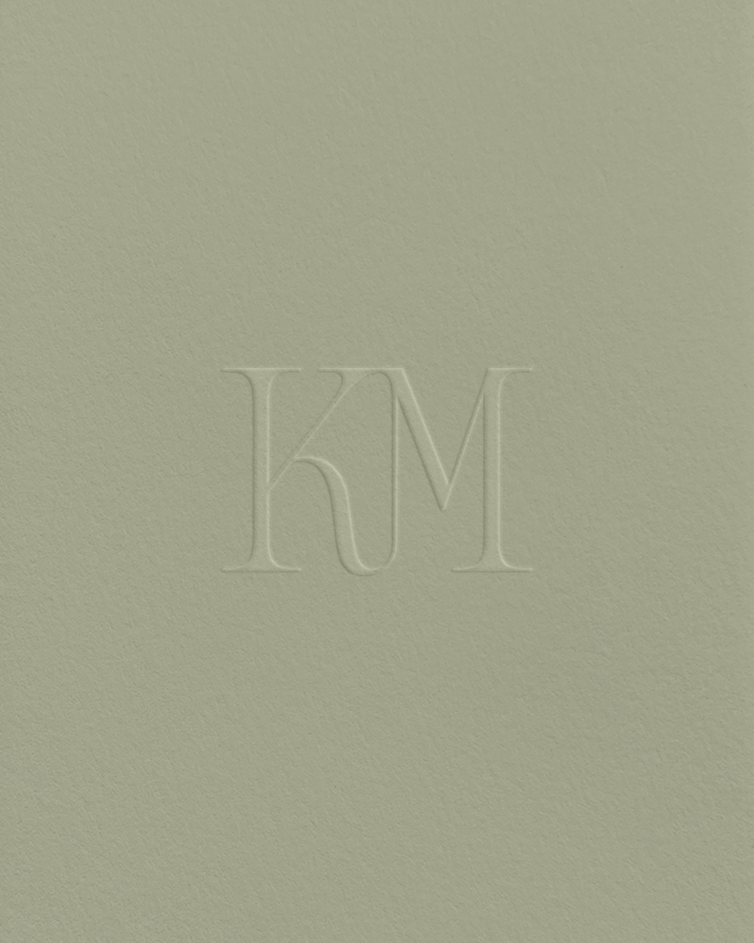
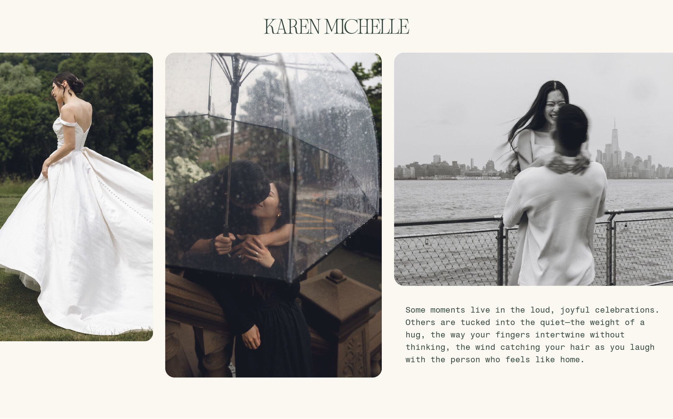
Visually, the brand draws inspiration from the feeling of a golden, slow afternoon—unhurried, warm, and quietly meaningful. Every design decision was made to evoke emotional depth without feeling heavy. As a result, the brand feels artistic but never inaccessible. The typography carries just enough elegance to signal refinement, but includes softened, curved details that keep it welcoming. The logotype was customized to strike a balance between structure and personality—serious about the work, but never stiff.
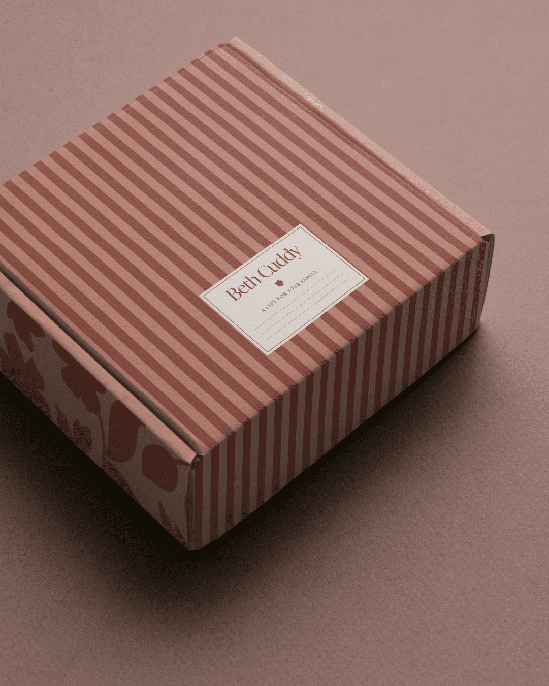
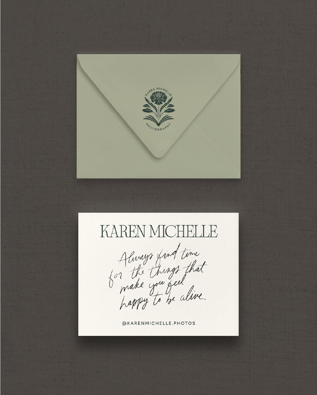
The marigold symbol became a central brand mark, chosen for its connection to storytelling, Karen’s Latin heritage, and fleeting beauty. It was paired with a subtle book motif—a nod to Karen’s love for stories and the way she visually narrates each client’s experience. The brand pattern, built from hand-drawn floral elements, introduces movement and texture that mirrors the layered emotions of a wedding day.
Even the text styling reinforces the brand values: legible and clean, with touches of character that feel human and familiar. Every element was chosen to support the idea of thoughtful storytelling and emotional connection.


The Solution
The final wedding photographer brand identity is rooted in clarity, connection, and care:
- A curated color palette that feels like an al fresco summer dinner with your partner
- Elegant serif logotype with thoughtful customization for personality and polish
- A custom submark symbolizing love, memory, and cultural meaning
- Brand patterns and textures that tell a story visually
- Refined font suite balancing sophistication and approachability
- Messaging that sounds like Karen: thoughtful, kind, and deeply human
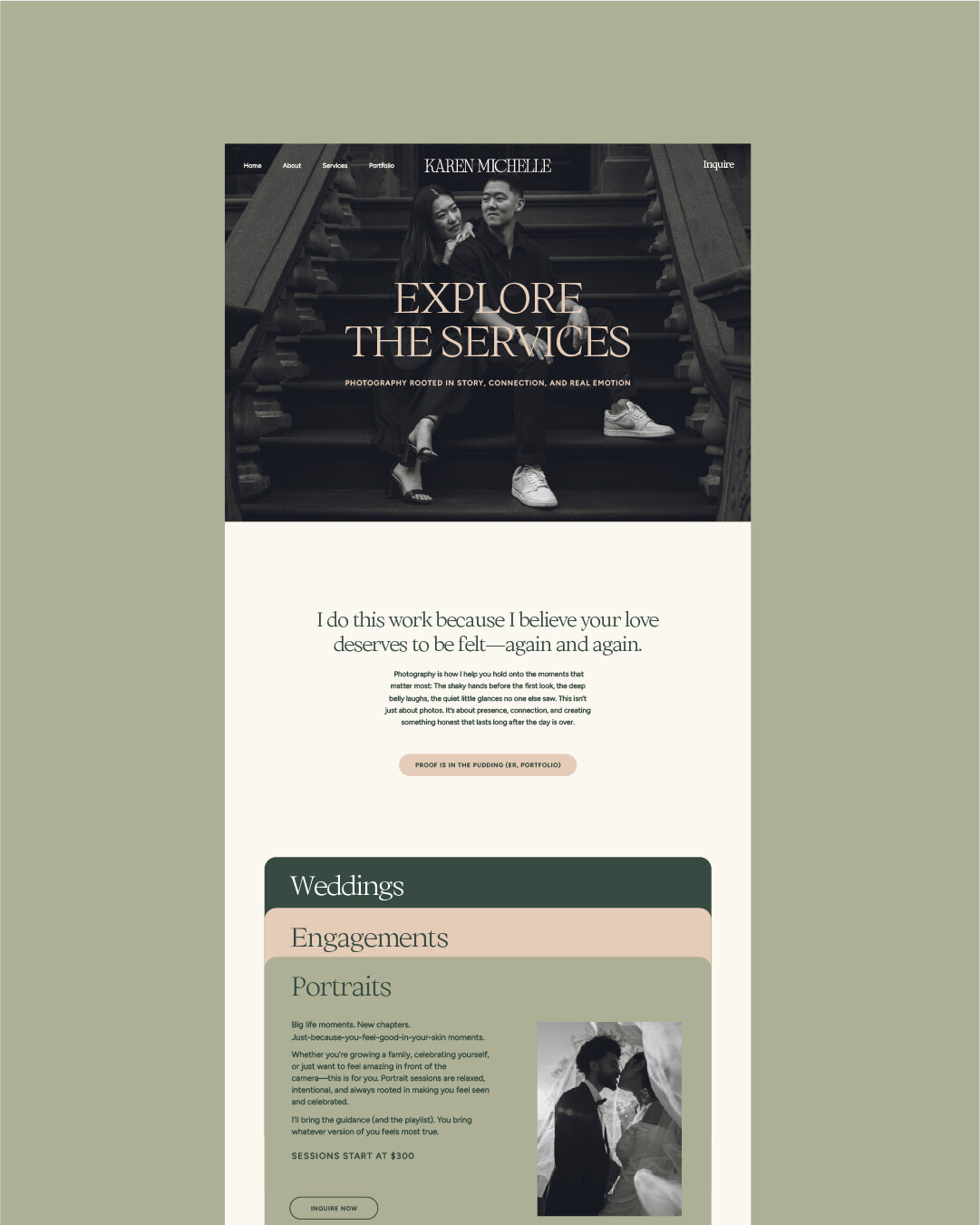
- And finally, a website that dances like dappled sunlight through the trees—layered with micro-animations, rich visuals, and intuitive navigation to welcome potential clients in to an immersive experience where they’ll want to stay awhile.
Every brand touchpoint—from the palette and typography to the marigold mark and immersive website—works together to deliver on her goal: to create a client experience that feels personal, emotionally resonant, and beautifully unforgettable.

The Impact
Karen’s new brand has given her the confidence to show up fully. Her website now mirrors the care she brings to every session. And most importantly, her brand is attracting the right kind of clients—people who value her presence, trust her process, and feel seen in her work.
It’s more than a new logo or color palette. It’s a foundation for lasting growth, clearer messaging, and deeper client relationships.

Credits
Brand Strategy, Identity Design, and Website Design by Gatherie Creative
Photography by Karen Michelle Photography
Looking for a brand identity that reflects your depth and drives real connection?
Step into my office. Inquire here