When Beth reached out, she was at a crossroads and ready to build a more sustainable business. Her family photography bookings weren’t matching the quality of her work, and despite clients telling her how much they loved working with her, she wanted to reach families who prioritize authentic, art-forward storytelling. So we didn’t just redesign her brand—we reimagined what family photography could feel like.
The Client
Beth Cuddy Photography
Family & Newborn Photography
Boston, Massachusetts
Beth has a background in the arts that shapes her eye for composition, and as a mother of four grown children, she understands the beautiful chaos of family life—the crumbs, the meltdowns, the fleeting moments of pure magic that happen between the planned poses. Her work captures emotion and connection with a dreamy, artistic quality that transforms ordinary moments into visual poetry.
The Brief
Beth came to me craving a brand that felt like her and supported where she’s headed. Even though her clients consistently raved about their experience, she was struggling to reach families who shared her vision for romantic, emotive, artistic family photography. Her goal: increase her annual revenue by attracting higher-investment families who savor intentional, experience-led sessions..
I needed to help her:
- Position her confidently within a premium, art-forward family photography niche
- Attract millennial families who crave authentic moments over perfect poses
- Develop a visual identity that reflects her unique blend of artistry and maternal intuition
- Create messaging that communicates the transformational experience she provides
The Process
First, we dove deep into strategy. Through comprehensive brand exploration, we discovered that Beth doesn’t just take photos—she creates immersive experiences that honor both the chaos and tenderness of real family life. Her background in fine arts and classical music, combined with her experience as a mother, gives her an intuitive understanding of how to capture connection in motion.
We identified her ideal client: style-forward millennial families who value experiences over things and want photos that feel like them—not staged or overly posed. They gravitate toward craftsmanship, sensory details, and an understated, ‘less-but-better’ ethos—and they’re willing to invest in meaningful experiences.
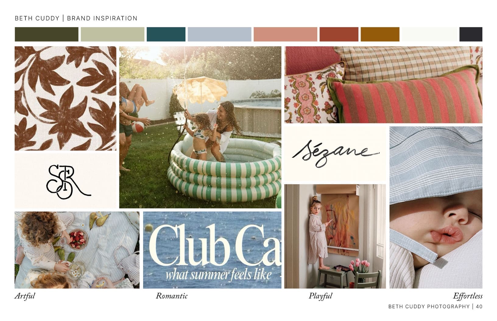
For the visual direction, we explored two distinct paths: one grounded in maternal warmth with soft neutrals and sage tones, another embracing romantic playfulness with muted pastels and pops of warmth. Both directions celebrated the intersection of chaos and beauty that defines Beth’s work.


The Solution
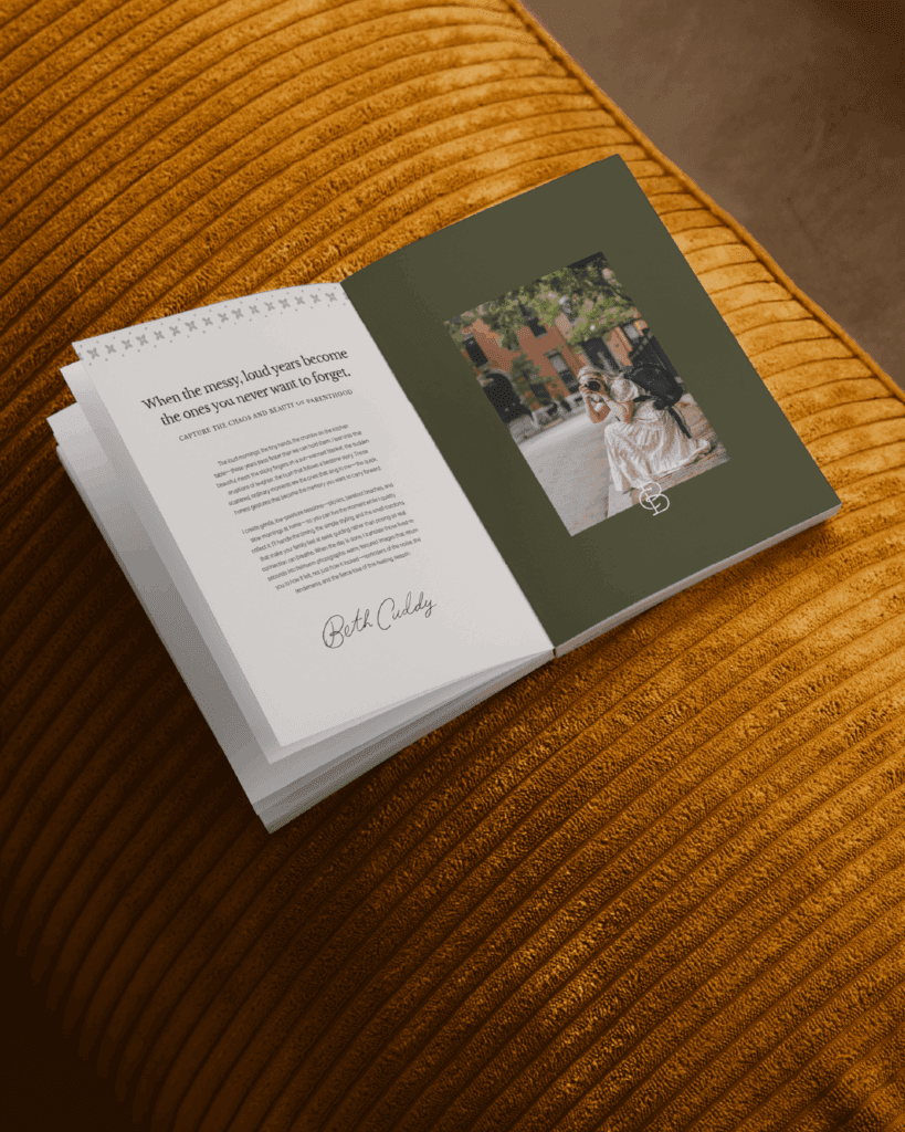
We delivered a complete brand transformation rooted in Beth’s mission: “Photographing everyday family life as visual poetry—through thoughtful, low-stress experiences rooted in beauty, presence, and play.”
Brand Strategy & Positioning:
- Mission and vision statements that capture her unique approach
- Target audience profiles with detailed psychographics and buying behavior
- Competitive landscape analysis positioning her in the luxury emotional storytelling space
- Brand personality framework: warm, poetic, intuitive, understated, and soulful
Visual Identity System:
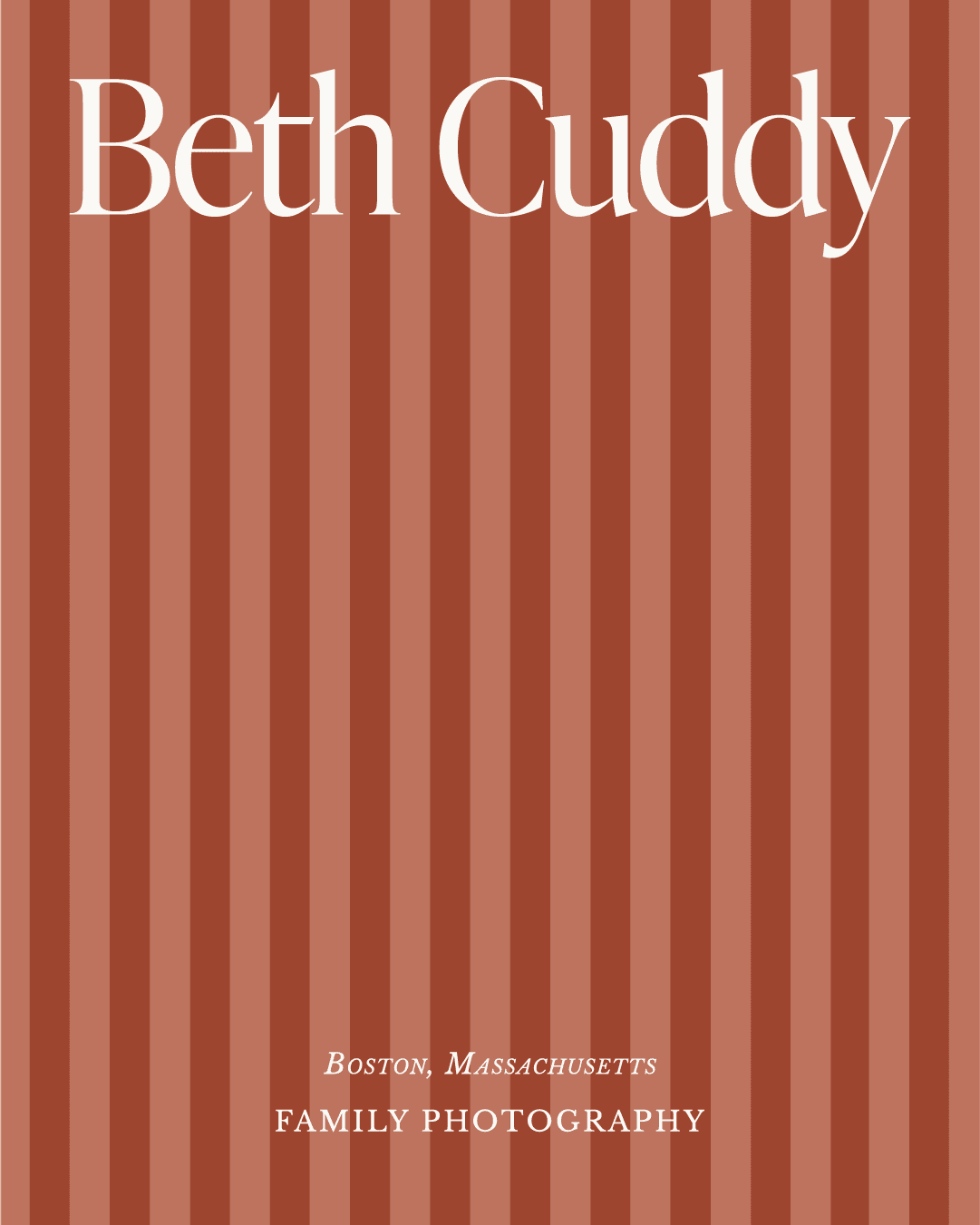
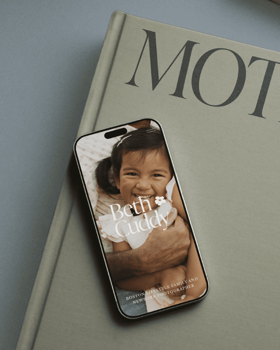
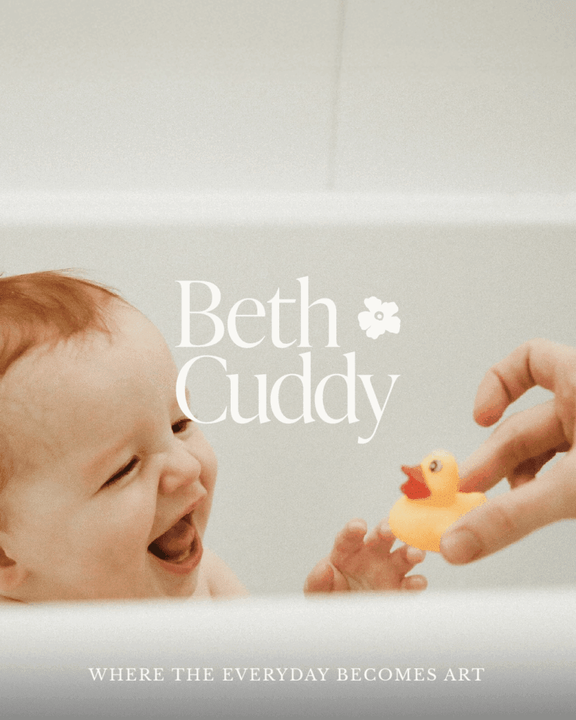
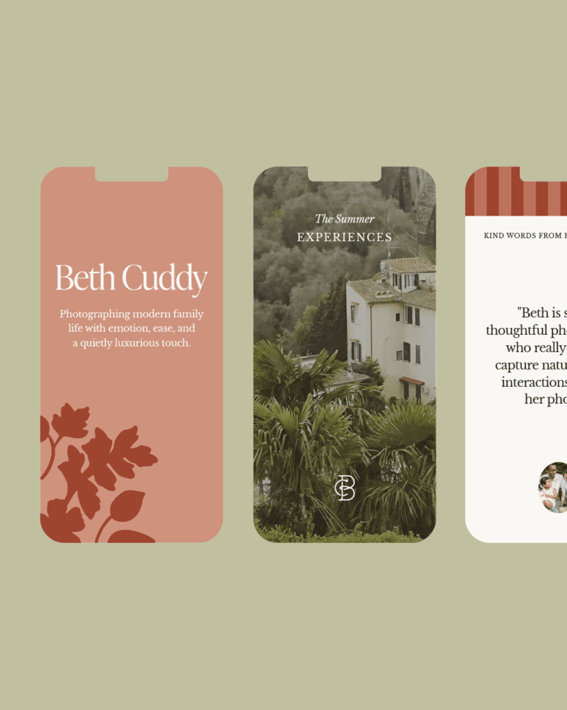
- Custom logo suite balancing artistic elegance with approachable warmth
- Carefully curated color palette evoking calm creativity and playfulness
- Typography that feels both editorial and intimate
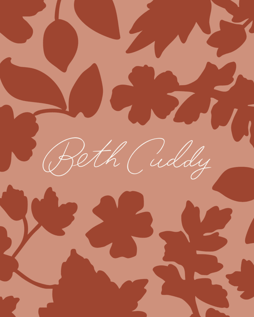
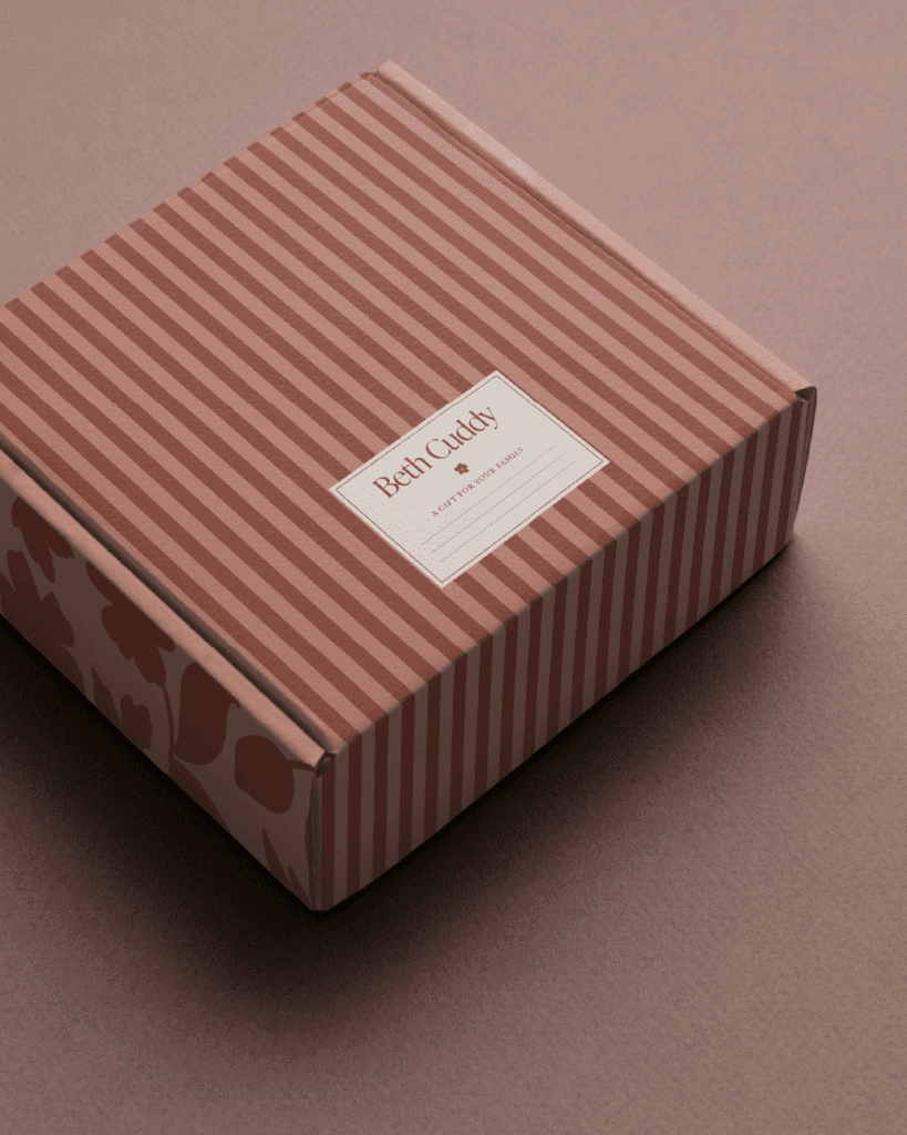
- Brand illustrations and patterns to bring the brand to life
- Brand guidelines ensuring consistent application across all touchpoints
Strategic Messaging:
- Primary brand message: “You show up. I’ll handle the rest—so you can be present, feel seen, and walk away with memories turned into art.”
- Voice characteristics emphasizing soft authority, poetic honesty, and curated ease
- Content strategy focused on storytelling that helps families imagine themselves in her immersive experiences
The Impact
Beth’s transformation goes far beyond a new logo. We gave her the clarity and confidence to step into the luxury market she’d always dreamed of serving. Her brand now speaks directly to families who value artistry, emotional connection, and experiences that feel like memories in motion.
The strategic foundation we built positions her to attract clients who see her sessions not as photo shoots, but as curated experiences—beach picnics, garden strolls, cozy morning moments that happen to be beautifully documented. Instead of competing on price, she now leads with the promise of presence, artistry, and the kind of photos that make you feel something every time you see them.
Most importantly, Beth now has a brand that feels authentically her—one that honors her artistic background, celebrates her intuitive connection with families, and attracts the exact clients who will value what she uniquely offers.
Credits
Brand Strategy, Identity Design & Messaging by Gatherie Creative
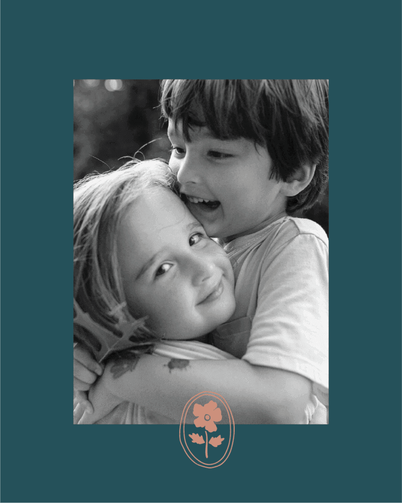
Photography by Beth Cuddy Photography
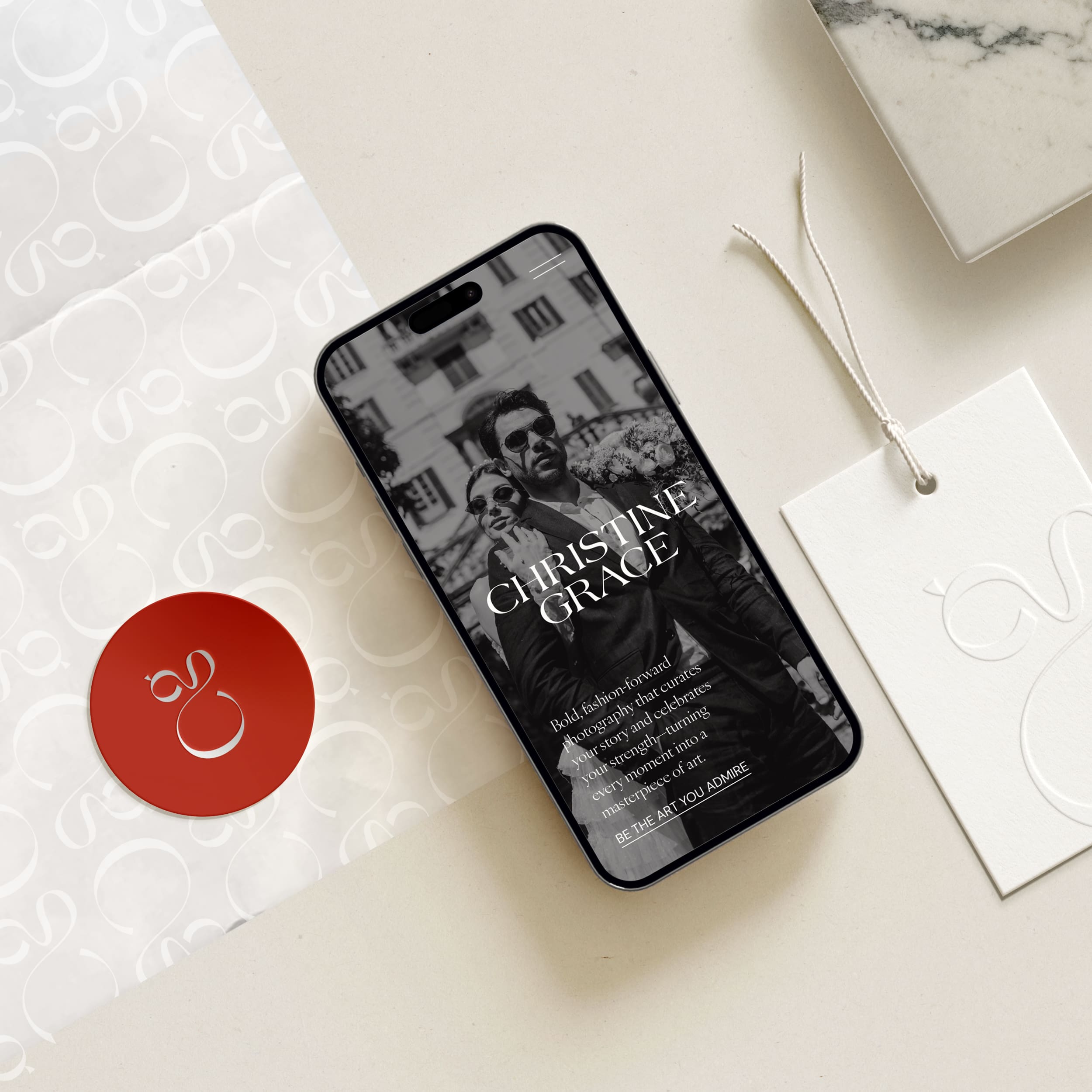
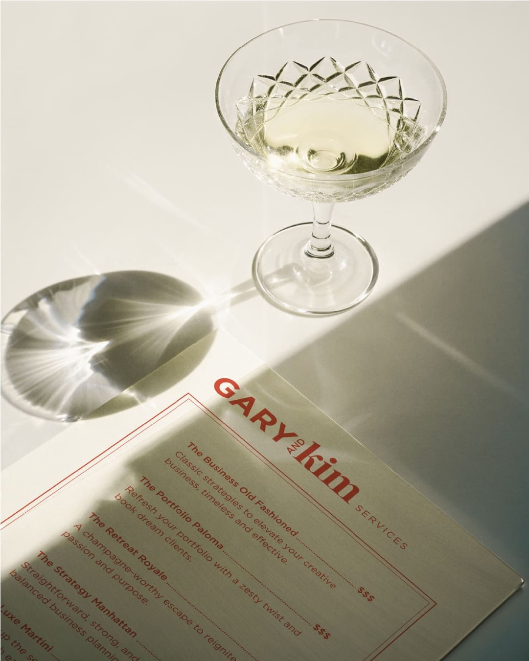
Select visuals are conceptual mockups used to demonstrate how the brand system can flex across touchpoints.
Ready for a Brand That Reflects Your Artistic Vision?
If you’re tired of attracting clients who don’t value your unique perspective, let’s change that. Step into my office and let’s create a brand that makes your ideal clients say “this is exactly what I’ve been looking for.”

